|
TreeView
Controls Suite 4.5 |
 | Overview |
 | Features |
 | Reference Book |
 | Live Demos |
| | Populating with Data |
| | Appearance |
| | Behavior |
| | Programming |
| | Application scenarios |
| |  | Update Panel |
|
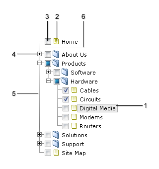
- Item.
Presented by the item node in the XML Structure. Customized via Skin's CSS Style classes:
.ItemDIV{}
.ItemHoveredDIV{}
.ItemSelectedDIV{}
- Item's Icon.
Presented by the icon and iconOpen node attributes in the XML Structure. The images must be located in the Skin Folder.
- Item's CheckBox.
Specified by the images in the Skin Folder:
CheckBox.gif
CheckBoxChecked.gif
CheckBoxCheckedSemi.gif
The property APNSoftTreeView.CheckBoxes specifies the value indicating whether check boxes are displayed next to the tree nodes.
- Expand/Collapse images.
Specified by the images in the Skin Folder:
Collapse.gif
Expand.gif
Or (if connecting lines are enabled):
CollapseBottom.gif
CollapseMiddle.gif
CollapseSingle.gif
CollapseTop.gif
ExpandBottom.gif
ExpandMiddle.gif
ExpandSingle.gif
ExpandTop.gif
- Connecting lines.
Specified by the images in the Skin Folder:
LineBottom.gif
LineMiddle.gif
LineSingle.gif
LineTop.gif
LineVertical.gif
TreeView automatically detects line images in the Skin Folder. You can show or hide lines by using the APNSoftTreeView.ShowLines property.
- Separator.
Presented by the separator node in the XML Structure. Customized via .SeparatorTD{} class in the Skin's CSS Style.
|