
 ComboBox |
| The professional replacement for the classic ASP.NET DropDownList component. |
 DataGrid |
| The server control to display data in a tabular format with options of choice, sorting and editing entries. |
 Include |
| The server control to include a HTML files into your ASP.NET pages as Server Side Includes (SSI). |
 Menu |
| The server control to display both statically and dynamically created menus on your Web pages. |
 Rating |
| The server control to easily provide feedback on an article, blog item, product description, etc. |
 TreeView |
| The ASP.NET server control to display hierarchical data in a tree structure. |
 |
|
What is a professional website menu?
May 16, 2012 | By Andrei Pogorelov
Summary
This article describes the basic characteristics the professional web menus should have. You will also learn about common menu drawbacks. This article will be useful for web developers and site owners who want to have a professional menu on their websites. I hope that our professional recommendations will help to create sites which will not irritate visitors but encourage successful websites.
Also, I will describe our product: Menu Control for ASP.NET Web Forms.
Contents
The menu is a main part of any website
The sad fact...
Why are most menus bad?
The characteristics of the professional menu
APNSoft Menu Control for ASP.NET
Conclusion
The menu is a main part of any website
If you think that the menu is an insignificant thing, you are completely mistaken. With the advent of the first website, a menu has become a major part of website evolution. The menu is the most simple, fast, and convenient way of navigation. Someone might believe the information (content) is more important, but it not so. The information will be inaccessible to the user without the tool to access it, i.e., the menu. As it turns out, the menu decides how and what to give the site visitor.
Menu - a door to the site
Menu - a window into the world of the site
Menu - an owner of the house in which you have come as a guest
Menu - the first handshake
The sad fact...
Almost every site has a bad menu. Menus are inconvenient, clumsy, and unfriendly. Today's visitors are more demanding of convenience and comfort than a few years ago. If the menu annoys the visitor, the website owner should take this seriously.
Why are most menus bad?
Let's use the analogy between the menu and the waiter. The waiter is very similar to the menu:
- The waiter greets you in the cafe; the menu is located in a conspicuous place on the site and is the first to communicate with the visitor.
- The waiter gives you the price-list of dishes; the menu is a set of items with links to the pages of the site.
- The waiter takes the order; the menu reacts on mouse clicks.
- The waiter brings your order; the menu shows you the selected page.
Now try to imagine that you are served by the "inadequate" waiter:
- He does not approach you; he needs to be called loudly.
- He quickly runs up to you or approaches at a snail's pace.
- He is dressed in strange clothes.
- He is standing next to your table but looking at the other table.
- He hides his face with his hands.
- He does not offer the list of dishes; you need to ask about each dish separately.
- He has not reached your table and has stopped every two meters.
- He is slightly deaf and asks everything twice.
- He pauses for ten seconds before answering you.
- He has taken your order and left you to wait when you let him go.
The list can be continued further. Fortunately, such waiters do not stay long in one job. But similar menus, unfortunately, linger for many years and annoy visitors. So, it is time to discover what some menus lack. I am sure that many of these drawbacks are familiar to you.
1. Reticent menu
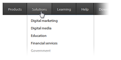
An item on the reticent menu has no the arrow which shows the presence of a submenu. In the given example, the item "Solutions" has a submenu, while the item "Help" does not. To check that a submenu exists, you should move your mouse over the item. And even in this case, you will not be completely sure that the item has a submenu. If the submenu does not appear, then there are only two options: either the submenu does not exist or the submenu is afraid of the cursor of your mouse.
2. Lazy submenu
You assume that the given item has a submenu, but it is insufficient to simply move your mouse over the item. In addition, you need also to click on it. When will you ever persuade the waiter to bring you the dish? The visitor has the risk of getting a callus on his finger.
3. Invisible submenu
Such submenu usually has the color which is closest to the background color. If you have moved the cursor over the item, and the submenu does not appear for a long time, it is possible that the submenu is already there and you just do not see it. Please open your eyes wider and look more closely. Do not blink.
4. Importunate submenu
You have moved the mouse over the item, and the submenu has appeared. Good. You have moved the mouse away, but the submenu does not hide. All is quite logical. The submenu is waiting when you finally wake up and click anywhere outside the submenu. Some importunate submenus also have a small cross in the corner that the user has to hit.
5. The menu for snipers

An item of such a menu has a large size but small text label. So, in order to select an item, the user must hit this small text. Such menus develop coordination of movements but require a high-precision mouse.
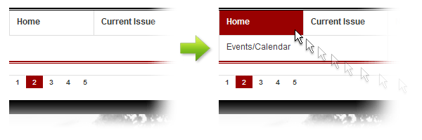
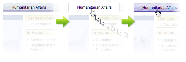
6. Strict menu
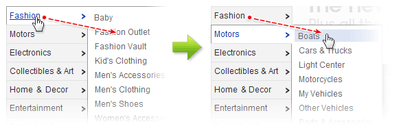
Such menus are usually located on the left side of the site. And why is it strict? Because such menus demand that the user move the cursor strictly horizontally along the chosen item. Otherwise, if the mouse accidentally touches another item, the user gets another submenu. A strict menu does not know that users do not move the mouse horizontally; they move the mouse on an inclined trajectory. Visitors, of course, understand the validity of such requirements and the second time (and some from the third, fourth, or even fifth) get in the desired submenu. The picture shows how we want to go to the "Fashion Outlet" and find ourselves on the "Boats" because the corner of the item "Motors" has been touched.
7. Horizontal submenu
The standard situation is when the main menu has horizontal orientation. But if the pop-up submenu is horizontal, it is extreme. It is difficult for users to move the mouse horizontally; it is much easier to move upwards-downwards on the vertical list. Such a menu is the next form of evolution of the Strict menu.
8. Sleeping menu
You bring the mouse to the item, but it remains almost without changes. There is no reaction to the user's action. Even if the cursor has turned into a "hand", it does not give full assurance that the item is ready to serve the user. Obviously, the menu is tired and has decided to relax a bit. Indeed, there are too many users, but the menu is unique. Try to visit the site a couple of hours later.
9. The menu with editing
You have brought the mouse to the item and see that the cursor has changed to the symbol for text input. Such menus always makes users happy because they can independently edit items. If the item text meets your wishes, it can remain without changes; but the text can be selected and copied into the buffer (Ctrl-C). A useful feature, right?
10. The menu without image caching
Some menus are very good-looking due to the use of images for the items. It is especially pleasant when the hovered item displays the "active" image. But sometimes the item disappears, and an "active" image appears with a delay of one to two seconds. It seems that the active item is a bit lost in the jungles of the network, and your mouse, at last, has shown its right place.
11. Narrow (poor) submenu
Such submenu has items with line breaks or items that are truncated with dots. Obviously, such narrowness is caused by the high cost of screen placement. The narrow submenu is an excellent way to save.
12. Wide (rich) submenu
Such a submenu has enough means for a superfluous screen placement. Such a submenu is in full contrast to a narrow submenu. Visitors appreciate such generosity.
13. Long submenu
The submenu displays a lot of items. And they are not always in alphabetical order. Sometimes the submenu does not even fit on the screen. In such cases, items can be placed in several columns. Visitors like to read such submenus in the long winter evenings.
14. A flash-like submenu
Such submenus pop up and disappear very quickly. How do you react to a waiter, which like a magician, disappears instantly and instantly appears with your dish? Are you frightened? Probably. Most likely the submenu does not know that jerky movements irritate people.
15. Heterogeneous items

Sometimes the submenu consists of heterogeneous elements. It confuses the visitor and looks like the site is not fully loaded or has problems with the style. Just imagine a table of contents in the book where lines have various font types and sizes. It is hard to imagine that you would want to read such a book.
16. Items with decorations
Quite often, the menu items have additional badges (arrows) on the right or left of the items. The user thinks that these arrows indicate the presence of a submenu, but he is deeply mistaken. These arrows are made for beauty. Beautiful, isn't it?
17. Semi-transparent submenu
Semi-transparency is an attractive feature but is no longer modern and can be very uncomfortable. The text of the page is visible through the submenu and complicates the reading of items.
18. Aggressive submenu
Such a submenu moves apart the blocks of the main page and comes out to show us what it can do. Do you like people who use their elbows to push others aside?
19. Acrobatic submenu
This submenu appears as a real dancer! The effects are different: Grow, Wipe, Twist, Slide, Bars, etc. Such a submenu does not allow the visitor out of its site. Sometimes the submenu appears with several effects at once, bringing twice the pleasure to the user. Can you imagine a waiter who does a somersault in the air, holding a tray with drinks?
20. Non-existent menu
Users do not know that a menu is on the page. The menu is not visible, but it might be somewhere. At some moment, when the user moves the mouse over the page, the menu suddenly pops up and immediately disappears. It strongly intrigues the visitor, and the next 10-20 seconds he enthusiastically seeks for it. Customs officers and sappers hold such menus in high respect.
This is certainly not the full list of problems that menus have. There are a lot of things lacking. I have described just a few widespread menu drawbacks.
The characteristics of the professional menu
Do you remember the comparison of the menu and a waiter? Here are the main features of the good waiter:
- He is always at hand.
- He does not bother you with his continual presence.
- He brings dishes quickly and without unnecessary questions.
- He intuitively feels what the client wants.
These features are related to menu too. What are the site visitor's needs? He needs only to click on the menu item to get to the required page in the shortest possible time. Nothing else. This action must be easy.
So, your menu should match the following characteristics:
1. Availability
- Menu items should have a large size that the user can easily hit with the mouse.
- The text of items should have good legibility. Use standard fonts and a contrasting color palette.
- Short lists, compact items, no duplicated elements, alphabetical order.
- Temperate graphics: only essential icons, arrows, backgrounds, etc.
- Shadow for popup elements (submenus) for better visualization.
2. Information capability
- The menu must immediately inform the visitor which items have a submenu and which do not. If the item has a submenu, the arrow must be displayed. This arrow indicates the direction in which the submenu pops out.
- The Menu should display a different (active) color for the hovered item. It would be good to use the "hand" mouse cursor on the hovered item. Thus, the user will see at once that the item is ready to process the mouse click.
- Good feedback. Menu should always inform the visitor about the progress of any task initiated by the user. An item should blink on the mouse click. A submenu should automatically close when an item is selected, and a new page is going to be opened.
3. Efficiency
- Fast and accurate response to user's actions.
- The absence of unnecessary requirements (clicks, mouse moves, etc.) for visitors to open the submenu, to close it, etc.
- The menu should understand that the user only wants to select an item. All auxiliary work is performed by the menu independently.
- No delays. Users want to see results immediately!
- No casual or unforeseen activities (submenu closing, incorrect behavior, blinking, etc.).
- No needless dynamic effects.
APNSoft Menu Control for ASP.NET
Now let me to tell you shortly about our product: the Menu for ASP.NET platform.
In 2003 we had the idea to create controls for web developers, and we founded the company APNSoft. The first our control we developed was the Menu. We decided right from the first that our product should be the best menu control available.
During the last several years we have closely explored the behavior and needs of site visitors, and today our Menu is the product which is the most carefully designed and is fully optimized in the smallest details. Our Menu has all the characteristics of a professional menu, and it is free from the previously mentioned disadvantages of some menus.
1. The Structure of the Menu
APNSoft Menu is a native Custom Control (library assembly - DLL) for Web Forms. The control is written on C# and includes all the required resources (structure, styles, images, etc.) to see the result immediately.
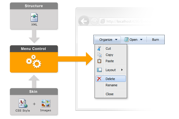
The Menu control is based on the kernel which uses XML and XSL transformation - the fastest and most economical way to generate final code for the browser. The page with our menu is ten times more quickly processed by the server than the page with the usual menu. Thus, visitors of your site will not waste time waiting, and your production server will not have to do extra work.
2. Fast Deployment
Our menu is a reusable control. Thus, it is very easy to add it to any website running under ASP.NET. Just put the dll in the Bin folder and write only two lines of code on your page:
<%@ Register TagPrefix="APNSoft" Namespace="APNSoft.WebControls" Assembly="APNSoftControls" %>

<APNSoft:APNSoftMenu id="myMenu" runat="server" />
If your site uses a master page, the menu can be added to the master page. After that, the menu will be automatically displayed on every page based on this master page.
3. Easy Customization
Our menu has been designed so that it does not require any special knowledge from developers.
The menu does not include a large number of methods and properties; this saves developers from the time-consuming work of learning the product before use.
A simple XML file can be used as a structure for Menu:
<Menu>
    <item title="Main Page" />
    <separator />
    <item title="About Us" />
    <item title="Products">
        <item title="Menu" />
        <item title="DataGrid" />
        <item title="TreeView" />
    </item>
    <item title="Contacts" />
</Menu>
Also, the structure can be taken from the database or created by using a flexible API.
The appearance is defined by the Skin. Skin is a standard directory which contains the CSS file and images:
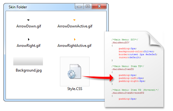
The SkinFolder property is used to link the Skin with the Menu. The collection of ready-to-use skins is available for immediate use of the product.
There are no additional efforts on the developer's side to adapt the menu to different browsers. The menu is fully compatible with all popular browsers - Internet Explorer 5.5+, Mozilla FireFox 0.8+, Google Chrome 6.0+, Opera 7.5+, and Safari 1.2+.
4. The Correct Behavior in the Browser
The behavior of our menu is very well thought out. The main objective is to provide comfort to the site visitor, with no wrong actions, delays, sudden movements, and other inconveniences, as described earlier.
In addition, our menu has a mechanism in which a submenu does not go over the edge of the window. The submenus always appear so that they are as visible as possible for the visitor. The special repositioning logic prevents "stacking" for submenus.
The menu caches the CSS and images. When the page is being loaded, the menu uses a special mechanism for displaying images immediately and without "empty squares."
Conclusion
I hope that our recommendations will help you develop a professional website.
If you are a .NET developer or your site is built on ASP.NET, we recommend you take a look at our ready-to-use Menu control. Using our Menu product will save you a lot of time and will provide you with a convenient and reliable menu on your website. There is professional support available.
More detailed information, live demos, and code samples can be found on this page:
http://www.apnsoft.com/Products/Menu/
Please rate the quality of this article:
Poor
Excellent
|